

Introduction: The Rise of Mobile Internet Usage
The Evolution of Web Browsing: From Desktop to Mobile
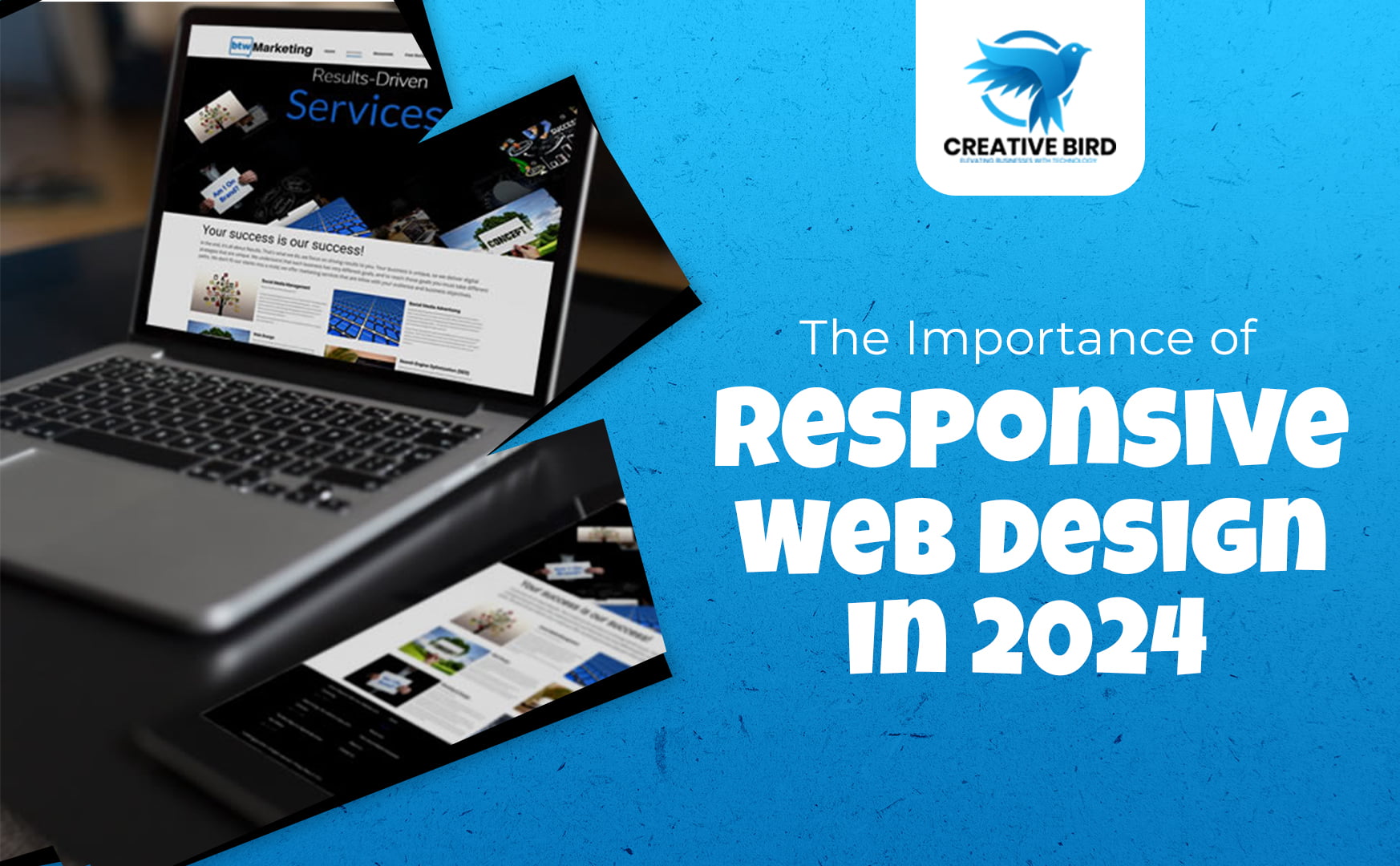
Why Responsive Design is Critical in 2024
Responsive web design is more than just a buzzword—it’s a fundamental aspect of modern web development. A responsive website automatically adjusts its layout, images, and content to fit the screen size of the device being used. This ensures that users have a consistent experience, whether they’re viewing your site on a smartphone, tablet, or desktop. Creative Bird prioritizes responsive design to ensure that your website looks great and functions flawlessly on any device.
Key Benefits of Responsive Design
Creative Bird's Approach to Responsive Web Design
Our Design Process
- Research and Planning: We start by understanding your business goals and target audience. This helps us create a design strategy that aligns with your brand and meets the needs of your users.
- Wireframing and Prototyping: Before diving into the design, we create wireframes and prototypes to map out the structure and functionality of your website. This allows us to test different layouts and ensure that the design is user-friendly.
- Responsive Design Implementation: Once the wireframes are approved, we begin the design process. Our team uses the latest technologies and best practices to create a responsive website that adapts to all screen sizes.
- Testing and Optimization: After the design is complete, we conduct extensive testing on various devices and browsers to ensure that your website performs well across the board. We also optimize the site for speed and SEO.